This chapter provides an overview of the F120 printer’s User Interface (UI). Specific printer operation information and procedures can be found in Chapter , 5 Operating the Printer (page 1). You must power ON the printer prior to using the touchscreen, see “Powering ON the Printer” (page 1) for instructions.
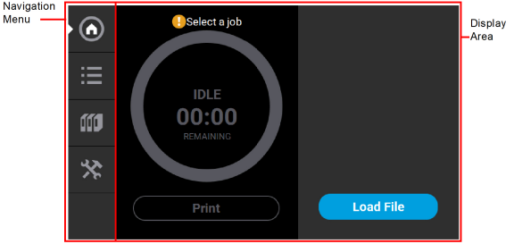
The User Interface is composed of a touchscreen located on the front right face of the printer (see Figure 1). Each page of the UI is composed of two main areas of functionality; these items are highlighted in Figure 1.
Figure 1: User Interface Overview
The touchscreen is designed to reduce glare; therefore, it is best to view the touchscreen when standing in front of the printer with the screen to your right. Viewing the touchscreen from any other angle may inhibit a clear view of the screen's display. The touchscreen is easy to use and allows you to:
•Access material load, unload, and calibration functions.
•Monitor printer status.
•Monitor material/head statuses (types loaded/installed, material coil box volumes, head odometers, etc.) and change materials and/or heads when necessary.
•Monitor build progress (name of job being built, materials usage information, estimated completion time, etc.).
•Access network configuration information and change printer defaults.
•Access the Job Queue and Sample Queue (internal storage).
The Navigation Menu provides one-touch access to the Build, Queue, Materials, and Tools functions of the printer (see Figure 1 for details). The User Interface is broken up into several pages of related functionality. Selecting a button from the Navigation Menu will open the button's corresponding page, allowing you to perform tasks within that page. If a page contains sub-pages, additional buttons corresponding to these items will be displayed within the page’s Display Area.
The buttons in the Navigation Menu are mutually exclusive, meaning only one button may be selected at a time. In some cases, a notification badge will be displayed within the button indicating a warning related to the functionality of the corresponding page. Buttons can appear as follows:
|
|
The bottom-most button in the Navigation Menu is non-functional. |


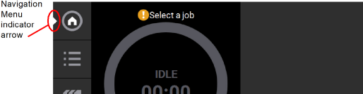
After selecting a button from the Navigation Menu, a white indicator arrow is displayed along the left-center edge of the button. This arrow indicates which Navigation Menu item is currently selected, making it easy for you to recognize which page of the UI you are viewing.
Figure 2: User Interface Overview
The Display Area contains the body portion of each page of the User Interface; this is where you can select from available functions and view current status. After selecting a button from the Navigation Menu, the Display Area will refresh and the main page corresponding to the selected button will be displayed. The information and buttons/icons shown within the Display Area will vary depending on which main page of the UI was selected.
The Build page is composed of the three main areas of functionality that are necessary for building parts on the printer; these items are highlighted in Figure 3. Within the Build page you can start, pause, and abort a job, view a build time estimate for the selected job, see status and estimated action points for a job in progress, and view a visual representation of the completed part. Please note that you must load a job file to the printer and select the file to be built before the job’s details will be displayed within the Build page.
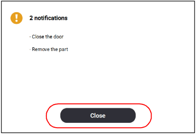
The Build page also contains the Notifications Display. Depending on the state of the printer a variety of notifications/warnings will be displayed within this area of the page. Touching the text on the screen will open a dialog indicating the reason(s) for the notification, and in some cases, steps to correct the notification (see Figure 4). Once all notifications have been corrected, press the Close button within the dialog to exit the dialog.
To access the Build page, press the Build button within the Navigation Menu; a screen similar to the one in Figure 3 will be displayed.
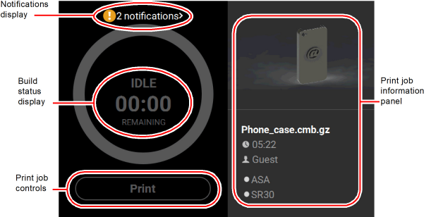
Figure 4: Notification Details
|
|
A job file must be loaded onto the printer and selected for building before the job’s details will be displayed within the Build page. |
The Print Job Information Panel is empty upon initial startup and the Build Status Display reflects its idle state. When there are no job files are available within the Job Queue, the Load File button will be displayed within the Build page. Visibility of this button is dependent upon the method used to load job files to the printer.
A job must be selected for building before the job’s details will be displayed within the Build page. In order to build a job, you must first load the job’s corresponding job file to the printer. Job files can be loaded via network transfer (Ethernet or Wi-Fi) using the GrabCAD Print application on your workstation PC or by plugging a USB flash drive into one of the printer’s USB ports and navigating to the job file via the Queue page (see “Adding a Job to the Job Queue” (page 13) for details). The job file you wish to build must be the first item listed in the Job Queue. Job files can be sorted as needed within the Queue page allowing you to select the job you’d like to build (see “Editing the Job Queue” (page 17) for details).
•If you send a single job file to the printer via network transfer using GrabCAD Print, the job’s details will automatically be displayed within the Build Status Display once the job file is received by the printer, as this job will be the only item in the Job Queue. The Load File button will be hidden from view once the job file is received by the printer via network transfer.
•If you send two or more job files to the printer via network transfer using GrabCAD Print, the job details of the first file sent will automatically be displayed within the Build Status Display once the job file is received by the printer, as jobs are built in the order they’re sent to the printer. The Load File button will be hidden from view once the first job file is received by the printer via network transfer.
•If you do not send files to the printer using GrabCAD Print and instead plug a USB flash drive into one of the printer’s USB ports, the Load File button will be visible within the Build page. You can use this button to select a single job file you’d like to build directly from the flash drive.
|
|
The Load File button within the Build page allows you to quickly select a single file to build off of a USB flash drive. The selected file will automatically be queued for building. If you’d like to populate the Job Queue with multiple job files, follow the instructions within “Adding a Job to the Job Queue” (page 13). |
To load a file:
1.Plug a USB flash drive into one of the available USB ports on the front of the printer (see Figure 3 (page 3) for USB port locations).
2.Press the Load File button within the Build page.
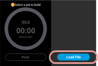
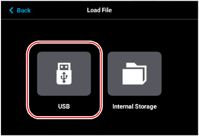
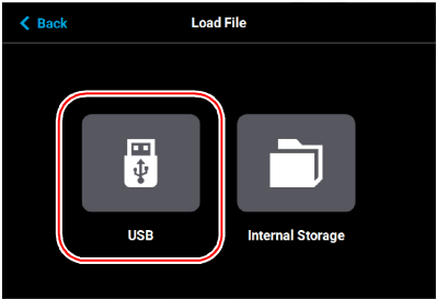
3.The Load File page will be displayed; press the USB button within this page.
Figure 6: Load File Page - USB Option
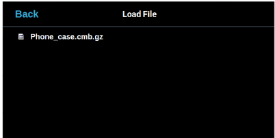
4.The Load File page will display the contents of the USB flash drive. Locate the desired job and select it by touching its row on the screen; doing so will open its Job Details page.
|
|
If both USB ports contain a flash drive individual folder graphics will be displayed on the screen representing each flash drive and its contents. Touching the folder graphic on the screen will drill down into the folder and display its contents. If a single flash drive is installed the job files located on the flash drive will be displayed in individual rows. |
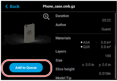
5.Within the Job Details page press the Add to Queue button; this will load the job into the Job Queue.
Figure 7: Add File to Queue
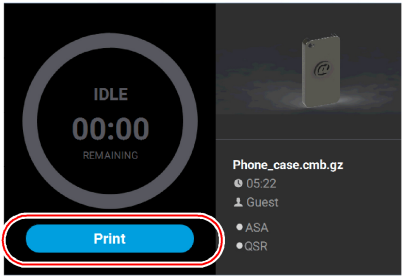
6.After pressing the Add to Queue button you will be returned to the Build page. The Load File button will no longer be visible. Instead, the details of the selected job file will be displayed within the Print Job Information Panel.
7.Pressing the Print button within the Build page will initiate the build. Build progress will be displayed within the Build Status Display, see “Build Status Display” (page 9) for details.
Figure 8: Build Page with Job Information
Information pertaining to a selected job is displayed within the right half of the Build page, within the Print Job Information Panel. This information is static and represents the details of the job file.
Figure 9: Print Job Information Panel
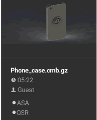
Information displayed within this panel is divided into the two sections:
The top-most section displays a visual representation of what the selected job will look like after it is successfully built.
The bottom-most section displays a variety of information pertaining to the selected job, including:
•Name of the job.
•Estimated build time for the job.
•Name of the user that submitted the job.
•Model and support materials associated with the job.
Touching anywhere within this portion of the screen will open a page displaying additional details pertaining to the selected job (see “Viewing Job Details” (page 18)).
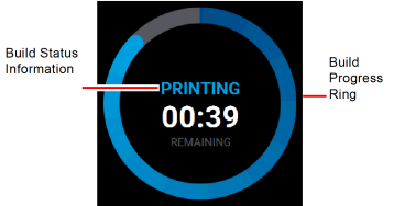
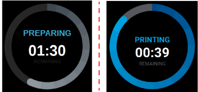
The Build Status Display section of the Build page is composed of a two-part graphic. The center portion provides information on a selected and/or building job while the outer progress ring corresponds with the build information displayed; the information displayed will vary depending on the state of the printer.
Figure 10: Build Status Display Overview
When the printer is idle, "IDLE" will be displayed within the center of the Build Status Display. This indicates that the printer is in a state where it is ready to start a build. No progress is indicated within the outer build progress ring and the time remaining is displayed as zero.
Figure 11: Build Status Display - Idle

|
|
A job file must be loaded onto the printer and selected for building before build information will be displayed within the Build Status Display. See “Loading a File” (page 5) for details. |
After pressing the Print button to start a build, "PREPARING" is briefly displayed within the Build Status Display, and the outer progress ring will fill, in gray, in a clockwise direction. This indicates the amount of time the printer requires to prepare for the start of the build, including the amount of time required for a Z Zero Calibration to occur (see “Z Zero Calibration” (page 17) for details).
Once build preparation is complete, "BUILDING" will be displayed within the center of the Build Status Display along with the amount of time remaining until the build is complete. As build progress is made, the amount of time remaining will get smaller until zero is reached, indicating that the build is complete. The build’s percentage of completion is also displayed by radially filling in the outer progress ring, in blue, in a clockwise direction.
Figure 12: Build Status Display - Building
Touching the screen within the center of the Build Status Display while a part is being built will toggle the information displayed. After touching the screen the time estimation information will be hidden from view and instead the Build Status Display will show the number of completed layers as compared to the total number of layers in the build. Touching the screen again, will toggle back to the time estimation information displayed initially.
A button is displayed within the Build page, just beneath the Build Status Display. This button is used to start, pause, or abort a build, depending on the status of the printer. The Print button option will become selectable after you’ve performed the steps necessary to load a file (see “Loading a File” (page 5)) and the printer is in a state where it is ready to build a part. This button will toggle to display the Pause and Abort button options when a build is in process.
Figure 13: Print Job Controls
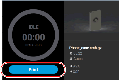
The Print button allows you to start a build (see “Selecting a Job to Build” (page 18) for more information). The Print button can appear in the following states:
|
Button State |
Description |
|---|---|

|
•Printer is in a buildable state AND a selected job is available to build. •Selecting the Print button will begin the build. |

|
•Print button is disabled and not selectable. •Printer is not in a buildable state OR a job is not selected/available to build (i.e. queue is empty). •To troubleshoot this issue, touch the text displayed on the screen within the Notifications Display. This will open a dialog allowing you to view the reason(s) for the current build state, including any issues impeding your ability to start a build (i.e. no substrate, etc.). See “Warnings at Build Start” (page 2) and “Errors Preventing a Build from Starting” (page 3) for more information. |
The Pause button allows you to pause an active build. The Pause button can appear in the following states:
|
Button State |
Description |
|---|---|

|
•Printer is actively building. Selecting the Pause button in this state will pause the build. •When the printer is paused, "PAUSED" is displayed within the Build Status Display. |

|
•Pause button is disabled and not selectable. •Printer is preparing for a build, there is no job currently building on the printer. |

|
•Printer is paused. The Pause button toggles to display the Play button. •Selecting the Play button will resume the build. •If the build was automatically paused as the result of an error, a notification will be indicated on the screen. Touching the notification text displayed will provide additional details pertaining to the current build state. See “Build Warnings” (page 20) and “Build Pause Warnings” (page 7) for more information. |
The Abort button allows you to abort an active build. The Abort button can appear in the following states:
|
Button State |
Description |
|---|---|

|
•Printer is actively building. •Pressing the Abort button in this state will initiate an abort of the build and will display a prompt asking you to acknowledge the abort. •If accepted, the build will be aborted. •If canceled, the build will be unaffected (i.e. revert to its previous state). |

|
•Abort button is disabled and not selectable. •There is no job currently building on the printer. |
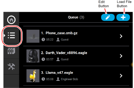
The Queue page contains the list of files (jobs) which have been downloaded to the printer and are queued for building; this list is referred to as the Job Queue. By default, jobs are added to the Job Queue in the order they were sent to the printer via GrabCAD Print and/or transferred from a USB flash drive. Individual jobs are listed in numbered rows with row one corresponding to the first job in the Job Queue. Each row displays the name of the job, estimated build time for the job, and name of the user that submitted the job. From the Queue page you can add files to the Job Queue, select a file to build, sort jobs within the Job Queue, view additional details associated with a selected job, and access the Sample Queue.
To access the Queue page, press the Queue button within the Navigation Menu; a screen similar to the one in
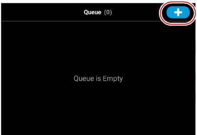
Figure 14 will be displayed. Please note that the Job Queue is empty upon initial startup.
The heading of the Queue page lists the number of jobs currently loaded into the Job Queue. Up to three jobs are displayed within the Job Queue list at a given time. If the Job Queue contains more than three jobs, use the scrollbar (to the right of the Job Queue list) to scroll up or down through the list of available jobs.
Pressing the Edit button within the heading of the page will display the Job Queue Control buttons; these buttons allow you to sort and /or delete the jobs within the Job Queue as needed. Pressing the Load File button within the heading of the page will allow you to add additional files to the Job Queue. Touching one of the rows listed within the Job Queue will open that job’s Job Details page; this page contains additional information pertaining to the selected job (material configuration, tip size, etc.). After selecting either of these buttons or opening a job’s details page a "Back" button will be displayed within the heading of the page; press this button to return to the main Queue page.
The Job Queue is empty by default. To populate the Job Queue you must first load individual job files to the Job Queue using one of two methods:
1.Network transfer via the GrabCAD Print application on your workstation PC. See “GrabCAD Print Method” (page 14) for detailed instructions. This is the preferred method for adding jobs to the Job Queue.
2.USB method via a USB flash drive inserted into one of the available USB ports on the front of the printer. See “USB Method” (page 14) for detailed instructions. This method can be used as a backup to the GrabCAD Print method if you are unable to transfer job files to the printer via your Ethernet connection (due to poor connectivity, a network outage, etc.) or Wi-Fi connection. This method also provides a convenient option for you to reprint a common job, as you can store the processed job file on the USB flash drive and access it repeatedly.
As part of the printer’s installation and setup process, you should have downloaded and installed the GrabCAD Print application onto your workstation PC (see “GrabCAD Print Software” (page 16) for details). GrabCAD Print is the software used to process job files and then transfer them to the printer (via your facility’s Ethernet connection or via Wi-Fi) to be built.
Jobs are sent to the printer in CMB format and are placed directly into the Job Queue. No additional steps are required to add a job to the Job Queue when sending job files directly to the printer via GrabCAD Print. After sending the job file to the printer navigate to the Queue page by pressing the Queue button within the Navigation Menu. The transferred job file will be displayed within the Job Queue list. Jobs will appear within the Job Queue in the order they’re sent to the printer from GrabCAD Print. To build a specific job, that job must be listed as the first item in the Job Queue. You can sort jobs within the Job Queue as needed to select the job you’d like to print (see “Editing the Job Queue” (page 17) for details).
The printer features three USB ports. A USB flash drive can be inserted into any of these ports and job files contained on the flash drive can be added to the Job Queue. Please note that job files should be processed using GrabCAD Print before they are placed onto the flash drive and subsequently added to the Job Queue. Once the flash drive is plugged into one of the printer’s USB ports, you will need to perform the following steps to add the desired job file to the Job Queue:
3.Plug a USB flash drive into one of the available USB ports on the printer (see Figure 3 (page 3) for USB port locations).
4.Navigate to the Queue page by pressing the Queue button within the Navigation Menu.
5.Press the Load File button in the upper-right corner of the touchscreen.
Figure 15: Load File Button Location
6.The Load File page will be displayed; press the USB button within this page.
Figure 16: Load File Page - USB Option
7.The Load File page will display the contents of the USB flash drive. Locate the desired job and select it by touching its row on the screen; doing so will open its Job Details page.
|
|
If any USB port contain a flash drive, individual folder graphics will be displayed on the screen representing each flash drive and its contents. Touching the folder graphic on the screen will drill down into the folder and display its contents. If a single flash drive is installed the job file(s) located on the flash drive will be displayed in individual rows. |
Figure 17: Select File to Load
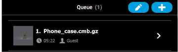
8.Within the Job Details page press the Add to Queue button; this will load the job into the Job Queue.
9.The file will load into the Job Queue. Once loading is complete the file will be added to the Job Queue list.
Figure 19: File Loading to Job Queue
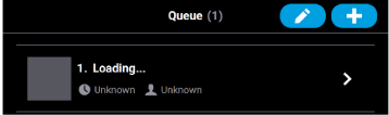
Figure 20: File In Job Queue
By default, jobs are built in the order in which they appear within the Job Queue. To build a specific job, that job must be listed as the first item in the Job Queue. Pressing the Edit button within the Queue page will open the Edit Queue page. Using the Job Queue Control buttons found within this page you can sort and /or delete the jobs within the Job Queue as needed, to ensure the job you wish to build is the first item listed within the Job Queue.
Pressing the Back button will allow you to exit the Edit Queue page and return to the main Queue page.
Figure 21: Edit Queue Page
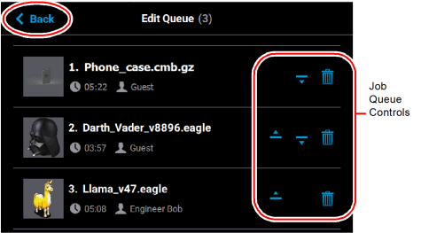
After opening the Edit Queue page three Job Queue Control buttons will be displayed within each row of the Job Queue list (one set of buttons per entry in the list). These buttons will allow you to rearrange the jobs in the Job Queue as needed. These buttons have the following functionality:
|
Name |
Button States |
Description |
|
|---|---|---|---|
|
Move Up |

|
Selectable |
•When selectable, moves the selected job up one position in the job Queue list. •To move a job to the top of the Job Queue list, press this button repeatedly until the job appears at the top of the list. •There is not an option to move a job directly to the top of the list. |

|
Disabled |
||
|
Move Down |

|
Selectable |
•When selectable, moves the selected job down one position in the Job Queue list. •To move a job to the bottom of the Job Queue list, press this button repeatedly until the file appears at the bottom of the list. •There is not an option to move a job directly to the bottom of the list. |

|
Disabled |
||
|
Delete |

|
Selectable |
•Removes the selected job from the Job Queue list. •You will not be asked to confirm this action prior to the job being deleted from the Job Queue. |
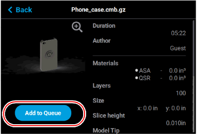
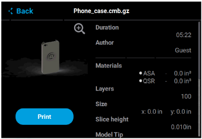
To view additional details regarding a particular job in the Job Queue, select the desired job by touching its row on the screen. Doing so will open its Job Details page; this page displays the following:
•Duration: amount of time required to complete the build.
•Author: name of the user that submitted the job.
•Materials: model and support materials associated with the job.
•Layers: number of layers in the job.
•Slice height: slice height associated with the job.
Use the scrollbar (along the right side of the page) to scroll up or down within the page. To close this page and return to the main Queue page, press the Back button within the header of the page.
Figure 22: View Job Details
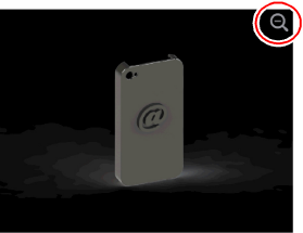
The left portion of the Job Details page displays a visual representation of what the part will look like once the build is complete.
Pressing the Zoom In button  within the upper-right corner of this portion of the page will hide the job details information and instead zoom in on the representation of the completed part (as shown in Figure 23).
Press the Zoom Out button in the upper-right corner of the expanded view display to close the expanded view and return to the Job Details page.
Figure 23: View Job Details - Expanded View
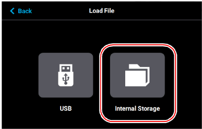
The printer comes with several sample job files permanently installed on its hard drive. These files are accessible via the Sample Queue. This queue is composed of a few sample part files as well as a variety of other files that are helpful for testing the printer. The majority of the files within the Sample Queue will be utilized only by authorized service representatives when performing maintenance on the printer. To access the Sample Queue:
10.Navigate to the Queue page by pressing the Queue button within the Navigation Menu.
11.Press the Load File button in the upper-right corner of the touchscreen (see Figure 15 (page 15) for button location).
12.The Load File page will be displayed; press the Internal Storage button within this page. The list of sample jobs contained within the Sample Queue will be displayed.
Figure 24: Load File Page - Internal Storage Option
Overall, the functionality of the Sample Queue is the same as that of the Job Queue:
•Additional details for a job can be viewed by opening its Job Details page.
•Within the Job Details page you can view the specifics of the job including build time, author, material requirements, number of layers, and slice height.
•Pressing the Zoom In button within the page will provide a detailed view of what the job will look like once it has been successfully built. Pressing the Zoom Out button will close this view and return you to the Job Details page.
•Pressing the Print button within the Job Details page will select the job for building.
However, the following functionality differences exist for the Sample Queue:
•“Job Queue Controls” are disabled for the Sample Queue, and therefore these job files cannot be deleted.
•Jobs in the Sample Queue cannot be sorted (as described in “Editing the Job Queue” (page 17)).
Working with the Materials Page
The Materials page displays a detailed representation of the printer’s current materials configuration. Within this page you can view the printer’s current materials configuration including material types and colors, view material coil box volumes and load statuses, load and unload materials, view current and set point head temperatures, and perform a variety of head related maintenance functions.
To access the Materials page, press the Materials button within the Navigation Menu; a screen similar to the one in Figure 25 will be displayed.
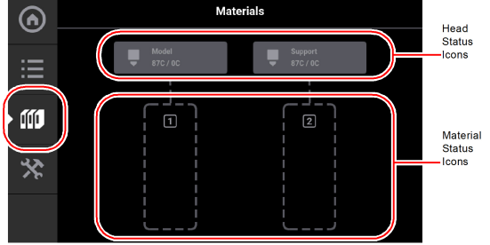
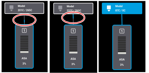
Two “Head Status Icons” are displayed within the upper portion of the Display Area. These icons display load status information as well as the current temperature as compared to the set point temperature of each of the printer’s heads (temperatures are predetermined and based on material type loaded to the head). The right-most icon pertains to the printer’s support head while the left-most icon pertains to the printer’s model head. Touching one of these icons on the screen will open that head’s Head Details page; this page contains additional information pertaining to the selected head as well as a button for initiating a variety of head maintenance functions. Icons will be solid gray or solid blue depending on their status.
Two “Material Status Icons” are displayed within the lower portion of the Display Area. These icons represent the model and support materials loaded/installed within the printer. The right-most icon indicate the status of the printer’s support material while the left-most icon indicate the status of the printer’s model material. These icons will take on a variety of colors and highlighted states depending on their status. Material coil boxes whose material is loaded to the head, are indicated by a blue border. Touching one of these icons on the screen will open that material’s Material Details page; this page contains additional information pertaining to the selected material as well as buttons for performing a material load or unload.
After selecting any icons or opening a details page a "Back" button will be displayed within the heading of the page; press this button to return to the main Materials page.
The two Head Status Icons within the Materials page display load status information as well as the current temperature as compared to the set point temperature of each of the printer’s heads.The right-most icon pertains to the printer’s support head while the left-most icon pertains to the printer’s model head. Touching one of these icons on the screen, unless otherwise indicated in Table 6, will open that head’s Head Details page. Various graphics will be displayed within the left portion of the Head Status Icons, depending on the state of the head. The Head Status Icons can appear in the following states (color usage, highlighting, and descriptions apply to both icons):
|
Icon State |
Description |
|---|---|

Empty (gray dashed border) |
•Indicates that the associated head is not installed. •User action required to install head. See “Head Replacement” (page 14) for instructions. •Touching the icon in this state will not display the head’s Head Details page. |

Invalid (red dashed border) |
•Indicates that the associated head is invalid. Note: This icon will also display when a model head is placed in a support location or a support head is place in a model location. in these cases, the head is usable when placed in its proper location. •User action required to replace head with a valid head. See “Head Replacement” (page 14) for instructions. •Touching the icon in this state will not display the head’s Head Details page. |

Initializing |
•Indicates that the printer is initializing the head. This state will be displayed until the initialization process is complete following installation of a new head. •Touching the icon in this state will not display the head’s Head Details page. |

Unloaded (solid gray) |
•Indicates that material is not loaded to the head. •User action required to load material. See “Loading Material” (page 3) for instructions. |

Loaded (solid blue) |
•Indicates that material is loaded to the head. •If a build has been initiated, the current temperature will increase until it reaches the set point temperature for the loaded material. Once temperature is reached, the tip will purge a small amount of material and the printer will begin building. |

Active (solid blue with white border) |
•Indicates that the head is actively performing a task other than building. •This state will be displayed whenever the head is purging or material is being unloaded from the head. |

Warning (head unloaded) |
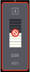
•Yellow coloring and an associated notification badge indicates a head related warning (see “Head Warnings” (page 12)). •Additional information regarding the warning and possible correction information is displayed by opening the associated head’s Head Details page (see “Viewing Head Details” (page 24)). •When the head’s odometer reaches 1350 build hours a warning will be displayed reminding you to order a replacement head as the head is approaching is odometer limit. |

Warning (head loaded) |
|

Error (head unloaded) |
•Red coloring and an associated notification badge indicates a head related error (see “Head Errors” (page 12)). •Additional information regarding the error and possible correction information is displayed by opening the associated head’s Head Details page (see “Viewing Head Details” (page 24)). •When the head’s odometer reaches 1500 build hours an error will be displayed. The printer is still able to build with this head, but you will be reminded before starting each build that the head’s odometer limit has been reached and part quality may be negatively affected. User action is required to replace head. See “Head Replacement” (page 14) for instructions. •If the associated head is incompatible with the location where it is installed (i.e. if the model head is installed in the support head location), an error will be displayed. After clicking on the error icon, a message will display with instructions to replace whichever head (model or support) was incorrectly installed. 
|

Error (head loaded) |
To view additional details regarding the printer’s model or support head, select the desired head by touching its Head Status Icon on the screen. Doing so will open its Head Details page. If the head is in a warning or error state additional information pertaining to the warning/error will be displayed within the page (see “Head Warnings” (page 12) and “Head Errors” (page 12) for details).
The right portion of the screen displays status information pertaining to the selected head:
•State: displays the load status of the corresponding head.
•Last Material: displays the type of material last loaded to the head.
•Date Loaded: displays the date that material was last loaded to the head.
•Odometer: displays the amount of build time for the selected head. This value is important as the printer will display different errors depending on the amount of build time for a head.
•When a head’s odometer reaches 1350 build hours the Head Status Icon will be displayed in its warning state, and you will be prompted to order a replacement head.
•When a head’s odometer reaches the 1500 build hours odometer limit, the Head Status Icon will be displayed in its error state, and you will be prompted to replace the head. You can continue to build using the head, but part quality will be unpredictable. It is recommended that you immediately change a head which has exceeded its odometer limit (see “Head Replacement” (page 14) for instructions).
•Serial Number: displays the head’s unique serial number.
•Manufacturing Date: displays the date that the head was manufactured.
The left portion of the screen displays the same Head Status Icon as is displayed on the Materials page (see Figure 25 (page 21)). This icon displays the current temperature as compared to the set point temperature of the head. The Maintenance button directly below the Head Status Icon will display a menu allowing you to perform a variety of head maintenance functions.
To close this page and return to the main Materials page, press the Back button within the header of the page.
Pressing the Maintenance button within the Head Details page will open the Head Maintenance page. The buttons within this page will allow you perform a variety of head maintenance functions. The buttons displayed in the menu within the right half of the screen will vary depending on whether the Enable button has been pressed. After pressing the Maintenance button the button will toggle and instead display the Details button. Pressing the Details button will close the Head Maintenance page and return you to the Head Details page.
Enable
Pressing the Enable button puts the corresponding head into a maintenance state when the top cover has been opened. Before you can perform any of the head maintenance functions available within the Head Maintenance page, you must put the head into this state by pressing the Enable button. After pressing the Enable button, the menu will refresh and display buttons corresponding to the additional head maintenance functions available within this page. The Enable button will toggle and instead display the Disable button. Pressing the Disable button at any time when the head is not in use will take the head out of the maintenance state.
Figure 27: Head Maintenance Page - Main View
Purge
Pressing the Purge button instructs the printer to perform a long purge. After pressing this button, the head will move to the purge position and will heat to a predetermined set point temperature. Once the head reaches this set point, material will be purged from the tip for about 10 seconds. When changing to or from colored material it is beneficial to perform multiple purges as this will remove all material remaining within the liquefier tips and/or tubes to ensure that color mixing doesn’t occur. The Purge button is selectable (i.e. a Purge can be initiated) when the button is solid blue, and disabled (i.e. a Purge is in process or cannot be initiated) when gray. A notification badge will be displayed within the button if any preconditions exist preventing the purge from occurring.
Load Head/Unload Head
Depending on the load status of the selected head, either the Load Head or Unload Head button will be displayed. Pressing the Load Head button instructs the printer to load material to the corresponding head; the button will toggle to display the Unload Head button. Pressing the Unload Head button instructs the printer to unload material from the corresponding head; the button will toggle to display the Load Head button. A notification badge will be displayed within the button if any preconditions exist preventing the load/unload from occurring (see “Load/Unload Errors” (page 5)).
Heat/Cool
Depending on the state of the printer, either the Heat or Cool button will be displayed. Pressing the Heat button instructs the printer to heat the corresponding tip to 270°C for no longer than 2 minutes; the button will toggle to display the Cool button. Pressing the Cool button will instruct the printer to begin cooling the corresponding tip back to the 0 set point; the button will toggle to display the Heat button. The tip will also begin to cool automatically if the heat option exceeds the 2 minute time allotment and the Cool button is not pressed.
Figure 28: Head Maintenance Page - Menu View
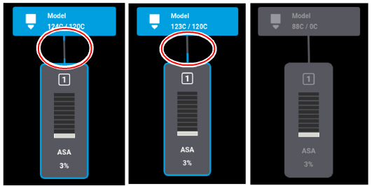
The Material Status Icons within the Materials page represent the model and support material coil boxes loaded in the printer. Either two icons will be displayed. Each icon displays a number corresponding to the material coil box, colored bars indicating the color of the material currently installed, the name of the material currently installed, and a percentage indicating the current volume of material on that material coil box. Touching one of these icons on the screen, unless otherwise indicated in Table 7, will open that material’s Material Details page. Various graphics will be displayed within the center of the Material Status Icons, depending on the state of the material coil box. The Material Status Icons can appear in the following states (color usage, highlighting, and descriptions apply to all icons):
|
Icon State |
Description |
|---|---|
Empty (gray dashed border) |
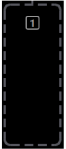
•Indicates the filament key is not inserted. •User action required to load material and insert the filament key. See “Loading Material” (page 3) for instructions. •Touching the icon in this state will display the Material Details page. |

Unusable (semi-solid red) |
•Indicates that an error occurred when checking the data on the material coil box’s memory chip. The material coil box is unusable. •User action required to replace the current material coil box with a valid one. See “Handling/Storing Materials” (page 14) and “Connecting Material Coil Box To Printer” (page 4) for instructions. •Touching the icon in this state will not display the material’s Material Details page. |
Invalid (red border) |
•Indicates that the material coil box is invalid. Invalid materials are materials not licensed or not compatible with the associated head type. •Material from the invalid material coil box cannot be loaded. User action required to replace the current material coil box with a valid one. See “Handling/Storing Materials” (page 14) and “Connecting Material Coil Box To Printer” (page 4) for instructions. |
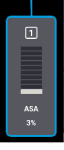
Loaded (blue border) |
•Valid material coil box connected. Material name, color, and current volume displayed. •Material from the material coil box is loaded to the head and is selected to be used for building. •See “Selecting a Job to Build” (page 18) for instructions on starting a build. See “Unloading Material” (page 11) for instructions on unloading material. |

Empty Material Coil Box |
•Material coil box is empty - a volume of 0% is displayed. •User action required to replace the empty material coil box. See “Unloading Material” (page 11) for instructions. |

Error (solid red) |
•Indicates that communication with the material coil box is not possible. Please note that this state differs from the unusable state as the icon is solid red in this state and the bars within the center of the icon are not visible. •Contact Customer Support or your regional Stratasys office if you experience this icon state (see “Getting Help” (page 1) for contact information). |
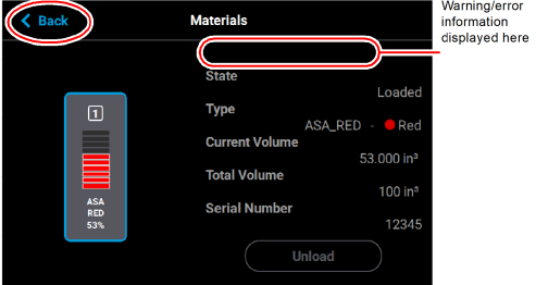
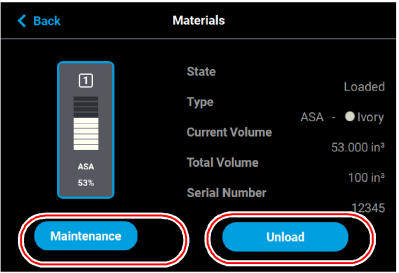
To view additional details regarding a particular material, select the desired material by touching its Material Status Icon on the screen. Doing so will open its Material Details page. If the material coil box is in a warning or error state additional information pertaining to the warning/error will be displayed within the page (see “Load/Unload Errors” (page 5) for details).
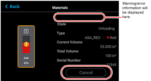
The right portion of the screen displays detailed information about the material coil box including:
•State: load state.
•Type: the type of material in the material coil box. If applicable, material color is also indicated (material color is also indicated within the center of the Material Status Icon within the left portion of the screen).
•Current Volume: current volume of material in the material coil box in cubic inches. This is also indicated via the percentage displayed within the Material Status Icon within the left portion of the screen.
•Total volume: total volume of material available, in cubic inches, when the material coil box was initially installed.
The buttons directly below this information allow you to load or unload material as needed or cancel a load/unload in process (see “Material Load Controls” (page 31) for details). Please note that the functionality and visibility of these buttons will depend on the material load status.
The left portion of the screen displays the same Materials Status Icon as is displayed on the Materials page (see Figure 25 (page 21)). The number displayed within the top of the icon indicates which material port the material is loaded into. The colored bars (displayed within the center of the icon) and percentage (displayed at the bottom the icon) indicate the current volume and color of the material in the material coil box. As material is used to build a part, the number of colored bars and the percentage will decrease to indicate the amount of material consumed. The name of the type of material in the box is displayed at the bottom of the icon.
To close this page and return to the main Materials page, press the Back button within the header of the page.
Figure 29: View Material Details
The Material Load Control buttons are used to load and unload material to the liquefier within the head, as well as cancel a material load or unload in process. The Material Load Control buttons are displayed in the lower-right portion of the Material Details page; however, the visibility of these buttons is dependent upon the material coil box’s load status. Button states are explained within the tables below.
Figure 30: Material Load Control Buttons
Pressing the Load button initializes the load wizard. The load wizard instructs the user on the steps necessary to load material into the F120 (see “Loading Material” (page 3) for details). If the corresponding head is already loaded with material, the Load button will appear in its disabled state.
Pressing the Unload initializes the unload wizard. The unload wizard instructs the user on the steps necessary to unload material from the F120 (see “Unloading Material” (page 11) for details).
The Cancel button will be displayed for a spool only after the spool’s corresponding Unload or Load button has been pressed. Pressing this button will instruct the printer to cancel the material load or unload already in process (see “Material Load/Unload Cancellation” (page 36) for details).
Pressing the Maintenance button displays the Material Maintenance screen.
Figure 31: Materials Maintenance Screen
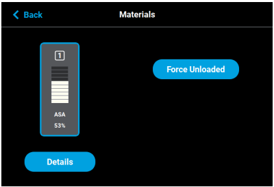
Pressing the Force Unloaded button sets the head and material bay to Unloaded status. This is used in situations where the system incorrectly displays a Loaded status for a print head. It is possible to use this button to set the head status to Unloaded when the head is actually loaded. If this occurs, perform a standard load procedure and the status will be corrected.
Pressing the Details button displays the Materials screen.
|
Button State |
Description |
|---|---|

|
•The load button is accessed from the Materials page. •Pressing the Load button in this state will initialize the load wizard for the corresponding head. |

|
Load button is disabled and not selectable. |
|
Button State |
Description |
|---|---|

|
•The Unload button is only selectable once a material filament is loaded to the corresponding head. •Pressing the Unload button in this state will initialize the unload wizard for the corresponding head. |

|
Unload button is disabled and not selectable. |
|
Button State |
Description |
|---|---|

|
•The Cancel button is never selectable. |
The pathway between the Material Status Icon and corresponding Head Status Icon will take on a variety of colors and display various graphics, depending on the load state of the associated material coil box’s filament. The pathway of the empty filament port will be dashed gray. Only one material type can be loaded/unloaded at a time (i.e. a model and support material coil box cannot be loaded/unloaded simultaneously). Filament pathways can appear in the following states (color usage, highlighting, and descriptions apply to both model and support):
|
Icon State |
Description |
|---|---|

Empty |
•Indicates that a material is not loaded into the corresponding filament port. •After connecting a material coil box to the printer, the filament pathway will refresh and indicate that filament needs to be inserted into the drive mechanism. |

Loading/Unloading |
•Indicates that filament from the corresponding material coil box is in the process of being loaded to the head. •The pathway between the Material Status Icon and the Head Status Icon will fill, in blue, in the direction that the material coil box’s filament is traveling (towards the head). •Once the load process is complete, the filament pathway will refresh and display in its loaded state. |

Loaded |
Indicates that filament from the corresponding material coil box is loaded to the head and is selected to be used for building. |
As materials are loaded and unloaded, the pathway between the Material Status Icon and the Head Status Icon will become colored, and will fill in the direction that the material coil box’s filament is traveling (towards the head or away from the head). Figure 32 (page 35) depicts the functionality displayed when a material coil box’s filament is being loaded to the head, while Figure 33 (page 36) depicts the functionality displayed when a material coil box’s filament is being unloaded from the head. Opening the Material Details page for the material being loaded/unloaded will provide additional control over the load/unload. The Cancel button will be displayed within this page, giving you the option to cancel the material load/unload if necessary.
Material load progress will display the same functionality regardless of whether a model or support material coil box is being loaded. Once a box’s material is loaded to the head, the pathway between the Material Status Icon and the corresponding Head Status Icon will be solid blue, the Head Status Icon will turn solid blue, and the Material Status Icon will display a blue border. This indicates that the material coil box is connected and in position to be used to build parts on the printer. The Unload button will be displayed within the Material Details page, indicating that material can be unloaded, if needed.
Figure 32: Material Load Progress - Loading
Material unload progress will display the same functionality regardless of whether a model or support material is being unloaded. As material is being unloaded from the head, the pathway between the Head Status Icon and Material Status Icon will be highlighted in yellow and the Head Status Icon will turn solid gray indicating that material is no longer loaded to the head. A yellow notification badge will be displayed within the center of the Material Status Icon to indicate that user action is required to complete the unload process.
Opening the Material Details page for the material being unloaded will provide additional details regarding the unload process. The Load button will be displayed within the Material Details page once the filament has been completely retracted indicating that the material can be reloaded, if needed.
Once material is fully unloaded, filament pathway and Material Status Icon coloring will remain in their unloading states until the corresponding material key is removed from its slot. Once the key is removed, which disconnects the material coil box, the filament pathway and Material Status Icon will refresh and display in their empty states.
Figure 33: Material Load Progress - Unloading
Material Load/Unload Cancellation
The Cancel button will only be displayed within the Material Details page for a material that is in the process of being loaded/unloaded. This button allows you to cancel a material load or unload already in process. Depending on your printer’s configuration, a warning may be generated after selecting the Cancel button. In the event of a warning, text will be displayed on the screen to indicate the cause of the warning.
Figure 34: Cancel Button
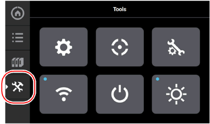
The options within the Tools page are organized into 6 categories: Settings, Calibration, Maintenance, Network, Power, and Light. The Display Area of the Tools page contains a button corresponding to each of these categories. With the exception of the Light button, pressing the button corresponding to each of these categories will open an individual page containing printer information that can be viewed as well as printer settings and preferences which can be configured for that particular category. After selecting any of the buttons within the Tools page a “Back” button will be displayed within the heading of the page; press this button to return to the main Tools page.
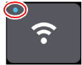
Within this page you can turn a variety of printer settings on/off (including part placement, standby mode, etc.), select your printer’s address type (dynamic, static, or Wi-Fi), adjust the brightness of the touchscreen display and turn the printer or the oven light on/off. As a part of its initial installation and setup (performed by your authorized service representative) your printer’s network settings will be configured within this page (as described within “Configuring the Network” (page 4)). Once those settings are configured you may need to occasionally access this page in order to adjust printer preferences.
To access the Tools page, press the Tools button within the Navigation Menu; a screen similar to the one in Figure 35 will be displayed.
The Display Area of the Tools page contains 6 buttons. With the exception of the Light button, pressing each of these buttons will open an individual page containing printer information that can be viewed as well as printer settings and preferences which can be configured.
|
Icon State |
Description |
|---|---|

Settings |
Pressing the Settings button opens the Settings page. From this page you can configure and adjust several of the printer’s default settings. See “Settings” (page 40) for details. |

Calibration |
Pressing the Calibration button opens the Calibration page. From this page you can preform various printer calibration procedures. See “Calibration” (page 51) for details. |

Maintenance |
Pressing the Maintenance button opens the Maintenance page. From this page you can perform various printer maintenance procedures. See “Maintenance” (page 54) for details. |

Network |
Pressing the Network button opens the Network page. From this page you can configure the printer’s network connection. See “Network” (page 58) for details. |

Power |
Pressing the Power button opens the Power page. From this page you can shutdown or restart the printer. See “Power” (page 64) for details. |

Light |
The Light button is the only option within the Tools page that does not open a new page after being pressed. Instead, the Light button allows you to turn the oven light ON and OFF. An indicator within the upper-left corner of the button displays the current state of the oven light (ON or OFF). See “Light” (page 65) for details. |
After selecting one of the buttons within the Tools page the touchscreen will refresh to display the details of the page selected (i.e. selecting the Settings button will open the Settings page). Depending on the options available for configuration within the selected page, the Display Area of the page may contain more options than can be displayed at one time. In this case, a scrollbar is displayed along the right-hand side of the page. To scroll up or down within a page simply touch the scrollbar displayed on the screen and pull the scrollbar in the direction you’d like to scroll.
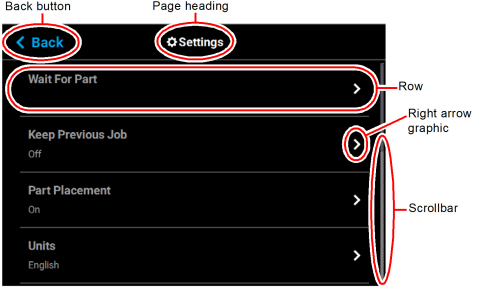
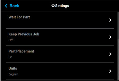
A heading is displayed at the top of each page, indicating the name of the page. Each page contains a variety of settings and preferences that can be configured. Items are organized into individual rows within the Display Area of the page. The name of the setting/preference to be configured is displayed in bold within the left side of the row. For some items, current configuration information is displayed directly below the setting/preference name within the row (for reference purposes).
The graphic displayed within the right side of a row will vary depending on the configuration options available for that row. Rows containing a right arrow graphic will open a new page allowing you to configure that row’s settings/preferences. Rows which do not contain a right arrow graphic do not have any configurable options. After making the necessary adjustments to a row’s settings/preferences, press the Back button in the upper-left corner of the page to exit the page.
Figure 36: Settings Page Content List
The Settings page allows you to turn a variety of printer settings on/off (including part placement, standby mode, etc.), configure the language and units the printer/UI is configured for, and adjust the brightness of the touchscreen display.
To access the Settings page, press the Settings button within the Tools page; a screen similar to the following will be displayed. Use the scrollbar (along the right side of the page) to scroll up or down through the list of available options.
Figure 37: Settings Page
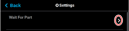
After sending a job file to the printer you would typically need to navigate within the User Interface in order to select the job from the Queue and start the build. The wait for part setting will instead allow you to send a job file to the printer which will then immediately start building once received by the printer.
Figure 38: Wait for Part
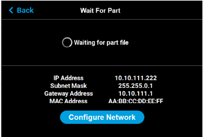
Pressing anywhere within the row will open the Wait For Part page. Opening this page will automatically put the printer into a state where it will wait to receive a job file to build immediately. After putting the printer into this state, you must send the processed job file to the printer via GrabCAD Print. Once the job file is received by the printer, the job will automatically start building. As such, ensure that the printer has been properly prepared for the start of a build (see “Before a Build” (page 16) and “Preparing the Printer” (page 17) for details).
Figure 39: Waiting for Part
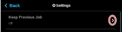
For privacy reasons, you have the option of choosing whether or not the printer’s previous job is stored within the Job Queue. If you're concerned about other users of your printer seeing what you’ve built, this setting allows you to prevent other users from accessing the printer’s previous job. When this setting is set to On, the printer will store its previous job file making it available for re-selection within the Job Queue. When this setting is set to Off, the printer’s previous job file will be deleted from the Job Queue upon completion of the build. The job’s file will need to be resent to the printer in order to be built again.
Figure 40: Keep Previous Job
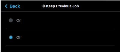
To configure this setting, press anywhere within the row; the Keep Previous Job page will be displayed. Use the radio buttons within the page to turn the setting On and Off as needed; On is selected by default.
Figure 41: Configure Keep Previous Job
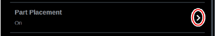
The Part Placement setting gives you the ability to select a job’s placement on a substrate. By default, single part jobs are built in the center of a substrate while packs are built according to their selected placement within GrabCAD Print. Therefore, when this setting is set to Off, single part jobs will automatically be built in the center of the substrate and packs will be built according their selected placement within GrabCAD Print. To configure this setting, press anywhere within the row; the Part Placement page will be displayed. Use the radio buttons within the page to turn the setting On and Off as needed.
Figure 42: Part Placement
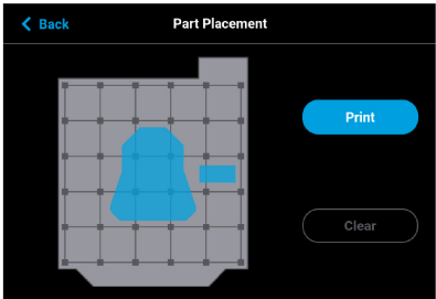
When this setting is set to On, you will be able to select a job’s location on the substrate prior to starting the build (see “Selecting a Job to Build” (page 18)). At the start of a build a dialog will be displayed asking you to select the part’s build location (see Figure 43). The dialog will contain a graphic representing your printer’s platen as well as a blue bounding box graphic (the imaginary box surrounding the part).
You can select the part’s build location by dragging and dropping the bounding box on the touchscreen; the bounding box cannot be placed outside the limits of the platen. Pressing the Print button will confirm your selected placement and start a build. "Ghost box" graphics are also displayed; a "ghost box" represents the location where a part was built previously. Clicking the Clear History button will clear the display, removing all "ghost box" items.
Figure 43: Part Placement Dialog
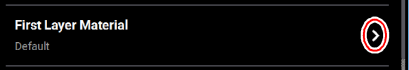
The First Layer Material row displays the material type to be used for the first build layer, Model or Default.
Figure 44: First Layer Material
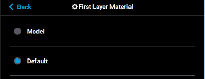
To configure this setting, press anywhere within the row; the First Layer Material page will be displayed. Use the radio buttons within this page to select between Model and the Default material, which could be either model or support material. If ABS or ASA material and .005” slice height are selected, model material is automatically used for the first layer of material.
Figure 45: Configure First Layer Material
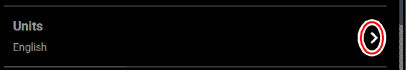
The Units row displays the type of units the printer is configured for, English (inches) or Metric.
Figure 46: Units
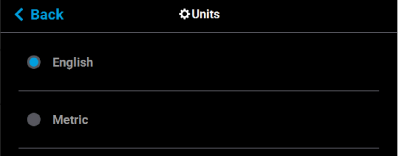
To configure this setting, press anywhere within the row; the Units page will be displayed. Use the radio buttons within this page to select between English and Metric units; English is selected by default.
Figure 47: Configure Units
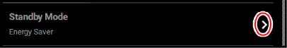
The Standby Mode setting gives you the ability to put the printer into an energy saving state after the completion of a build. When the Energy Saver radio button is selected (i.e. Standby Mode is turned On) the printer’s oven will automatically shut off 2 hours after the completion of a build, thus saving energy. When the Quick Start radio button is selected (i.e. Standby Mode is turned Off) the printer’s oven will remain On for 60 hours after the completion of a build and oven temperature will stay at the material’s build temperature.
Figure 48: Standby Mode
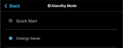
To configure this setting, press anywhere within the row; the Standby Mode page will be displayed. Use the radio buttons within the page to select between the Energy Saver and Quick Start options as needed. The Quick Start radio button is selected by default (i.e. Standby Mode is set to Off by default).
Figure 49: Configure Standby Mode
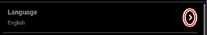
The Language row displays the language that the User Interface is configured for. Language options include English (default), Spanish, French, German, Italian, Korean, Russian, Chinese (traditional or simplified), and Japanese.
Figure 50: Language
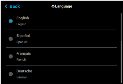
To configure this setting, press anywhere within the row; the Language page will be displayed. Use the scrollbar (along the right side of the page) to view the list of available languages. Select the radio button corresponding to your desired language.
Additionally, the first time the printer is powered ON, a dialog will be displayed asking you to select your desired language. Once you’ve set your desired language following initial power up, this selection will be retained and can only be changed by navigating to the Language page and adjusting your language selection.
Figure 51: Configure Language
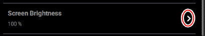
The Screen Brightness setting allows you to adjust the brightness of the touchscreen display.This setting is displayed as a percentage with 100% percent representing the greatest amount of brightness available.
Figure 52: Screen Brightness
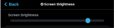
To configure this setting, press anywhere within the row; the Screen Brightness page will be displayed. Within this page use the slider graphic to adjust brightness as needed. Sliding to the right will increase brightness while sliding to the left will dim brightness. Please note that you cannot set screen brightness to 0% (completely dim).
Figure 53: Configure Screen Brightness
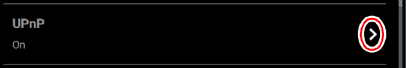
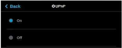
UPnP allows the printer to broadcast its Unique Device Name (UDN) address across the network. When this setting is set to On, the printer will broadcast its UDN across the network allowing GrabCAD Print to automatically detect the IP address of the printer for communication. When this setting is set to Off, the printer will not broadcast its IP address across the network and GrabCAD Print will need to be manually configured to communicate with the printer.
Figure 54: UPnP
To configure this setting, press anywhere within the row; the UPnP page will be displayed. Use the radio buttons within the page to turn the setting On and Off as needed; On is selected by default.
Figure 55: Configure UPnP
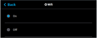
The Wifi setting gives you control over the printer’s Wi-Fi capabilities. Please note that the functionality of this setting is dependent upon the use of a Wi-Fi dongle purchased for use with the printer. When this setting is set to On, you will be able to configure the printer to scan for and connect to an available Wi-Fi network. You will then be able to send part files to the printer via this network. When set to Off, Wi-Fi capabilities will be disabled and you will instead need to send part files to the printer via your facility’s Ethernet connection or through the use of a USB flash drive (see “Configuring the Network” (page 4) for details).
Figure 56: Wifi

To configure this setting, press anywhere within the row; the Wifi page will be displayed. Use the radio buttons within the page to turn the setting On and Off as needed; On is selected by default.
Figure 57: Configure Wifi
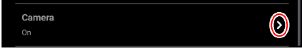
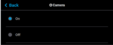
The Camera setting gives you control over the printer’s camera. When this setting is set to On, the printer’s camera will automatically provide remote monitoring capabilities while a part is being built. When this setting is set to Off, the camera will be turned off and remote monitoring capabilities will be disabled.
Figure 58: Camera
To configure this setting, press anywhere within the row; the Camera page will be displayed. Use the radio buttons within the page to turn the setting On and Off as needed; On is selected by default.
Figure 59: Configure Camera
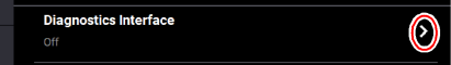
This feature is for future use and is presently not supported. Stratasys will provide more information and training for its use and capabilities in the near future.
Figure 60: Diagnostics Interface
The Remote Access Permissions settings allow the user to pause the current build or set the printer to standby mode. This feature is used in conjunction with the GrabCAD Print mobile application and a cellular phone.
Figure 61: Remote Access Permissions

To configure this setting, press anywhere within the row; the Remote Access Permissions dialog displays.
Figure 62: Remote Access Permissions Dialog
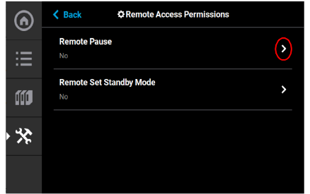
Both the Remote Pause and the Remote Set Standby Mode are set to No at the factory. To change the Remote Pause setting to Yes, press anywhere within the row; the Remote Pause dialog displays.
Figure 63: Remote Pause
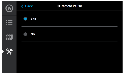
Setting the Remote Pause radio button to Yes allows for pausing the build via the GrabCAD Print mobile application and a cellular phone. Once the build is paused, it cannot be restarted remotely. The build restart must be physically performed on the printer.
The printer can also be remotely set to Standby mode using the Remote Set Standby screen and the GrabCAD Print mobile application.
Figure 64: Remote Access Permissions Dialog

To change the Remote Set Standby setting to Yes, press anywhere within the row; the Remote Set Standby dialog displays.
Figure 65: Remote Set Standby
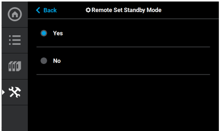
Setting the Remote Set Standby radio button to Yes allows for setting the printer to Standby mode via the GrabCAD Print mobile application and a cellular phone. Once the printer is set to Standby mode, the printer mode cannot be changed remotely.
|
|
This section provides an overview of the Calibration page and its features, but does not go into detail regarding calibration procedures. See “6 Calibration and Adjustments” (page 1) for detailed calibration procedure information and instructions. |
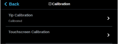
The Calibration page allows you to perform a variety of calibration procedures on the printer, including:
•Tip Calibration
•Touchscreen Calibration
To access the Calibration page, press the Calibration button within the Tools page; a screen similar to the following will be displayed.
Figure 66: Calibration Page
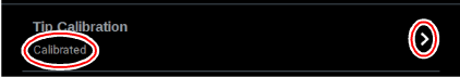
The printer’s calibration status will be displayed within the Tip Calibration row. Calibrated or Not Calibrated will be displayed depending on the printer’s Calibration status.
Pressing anywhere within the Tip Calibration row will open a page allowing you to select from a variety of tip calibration options.
Figure 67: Tip Calibration
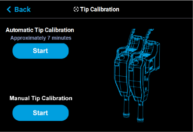
The Tip Calibration page contains an option for performing an Automatic Tip Calibration as well as a Manual Tip Calibration. Pressing the Start button associated with either of these options will allow you to perform that particular calibration procedure. Each calibration procedure is delivered in the form of a wizard which will guide you through the process of performing the calibration procedure. See “Automatic Tip Calibration” (page 2) and “Manual Tip Calibration” (page 5) for detailed instructions.
Figure 68: Tip Calibration Options
Pressing anywhere within the Touchscreen Calibration row will open a dialog allowing you to recalibrate the touchscreen display. See “Touchscreen Calibration” (page 14) for detailed instructions.
Figure 69: Touchscreen Calibration

|
|
This section provides an overview of the Maintenance page and its features, but does not go into detail regarding printer maintenance procedures. See Chapter , 7 Maintenance (page 1) for detailed maintenance information. |
From this page you can perform a variety of maintenance procedures on the printer, and view diagnostic/printer state information. Please note that advanced maintenance must be performed by an authorized service representative only.
To access the Maintenance page, press the Maintenance button within the Tools page; a screen similar to the following will be displayed.
Figure 70: Maintenance Page
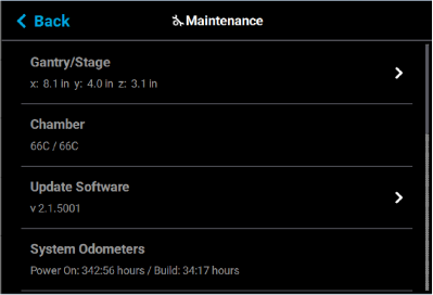
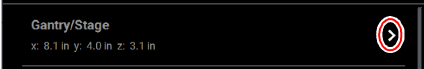
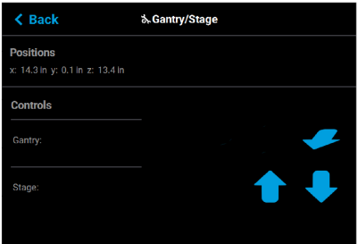
Position information for the X, Y and Z axes is displayed within the Gantry/Stage row. Pressing anywhere within the Gantry/Stage row will open the Gantry/Stage page.
Figure 71: X, Y, Z Position
The single directional arrow button within the Gantry: section allows you to move the head in the X and Y axis. Pressing the Front Arrow button moves the head assembly to the front of the gantry.
The two directional arrow buttons within the Stage: section allow you to move the platen (Z) up or down.
•Up: pressing the Up Arrow button moves the Z stage to the mid-Z position.
•Down: pressing the Down Arrow button moves the Z stage to the lower-Z position.
The information displayed within the Positions portion of the page will update to reflect X, Y, and Z positioning changes made using the directional arrow buttons.
Figure 72: Gantry/Stage Page
The Chamber row displays the current temperature as compared to the set point temperature of the oven chamber.
Figure 73: Chamber Temperature

The Update Software row displays the version of Controller Software installed on the printer.
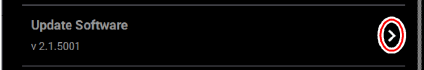
Pressing anywhere within the Update Software row will open a page allowing you to upgrade the printer’s Controller Software version (see “Updating Controller Software” (page 1) for details).
Figure 75: Update Controller Software Page
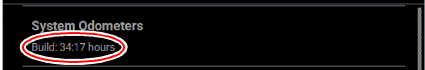
The System Odometers row displays the number of hours in which the printer has been building.
Figure 76: System Odometers
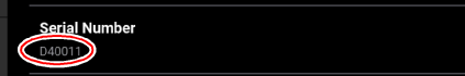
The Serial Number row displays the printer’s unique serial number. This number can also be found on the label on the exterior surface of the printer (see Figure 3 (page 3) for serial number tag label placement).
Figure 77: Serial Number
Pressing anywhere within the Open Source Licenses row will open a page displaying legal information pertaining to the open source software running on the printer. The files displayed are read-only.
Figure 78: Open Source Licenses

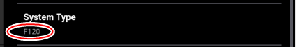
The System Type row displays the printer’s model type information F120.
Figure 79: System Type
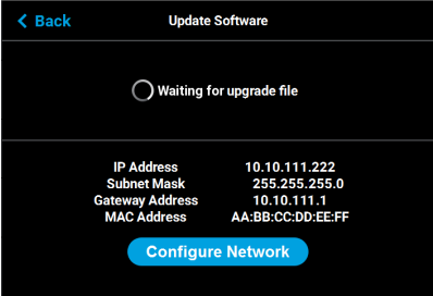
Pressing anywhere within the USB Tools row will open a page allowing you to:
•upgrade the printer’s Controller Software version from an installed USB Flash drive (see “Updating Controller Software” (page 1) for details).
•export the system configuration file to an installed USB Flash drive (see “Exporting System Configuration (.CFG) File” (page 5) for details).
Figure 80: Update Software

|
|
Your printer was configured for your network as a part of its initial installation and setup (see “Configuring the Network” (page 4)). The information within this section is provided to help you understand the functionality of the Network portion of the Settings page. |
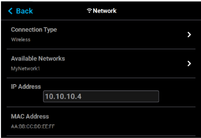
Within the Network page you can configure your printer’s network connection, options include Static, Dynamic (default), or Wi-Fi. The network type selected will determine the rows and configurable settings displayed within the Network page.
To access the Network page, press the Network button within the Tools page; a screen similar to the following will be displayed.
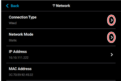
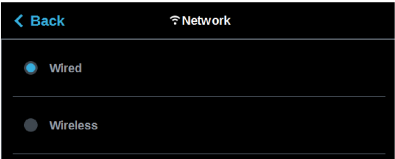
Pressing anywhere within the Connection Type row will allow you to select between a wired (Static or Dynamic) or wireless (Wi-Fi) network; Wired is selected by default. Use the Wired and Wireless radio buttons to select a connection type. After selecting a connection type press the Back button to exit and return to the Network page; the selected connection type will be indicated within the Connection Type row (see Figure 83 (page 60) and Figure 84 (page 60) as a reference).
|
|
The Wireless connection type option will only be displayed if a Wi-Fi dongle has been installed and the printer’s Wifi setting is set to On (see “Wifi” (page 47) for details). If a dongle has not been installed, or if a dongle has been installed but the printer’s Wifi setting is set to Off, this row will be hidden from view and you will not have the option of configuring a Wi-Fi network. |
Figure 82: Select Connection Type
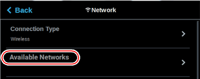
Depending on the Connection Type selected (Wired or Wireless) the second row displayed within the Network page will vary.
•If the Wired connection type is selected, the Network Mode row will be displayed.
•If the Wireless connection type is selected, the Available Networks row will be displayed.
See the detailed information in the sections below for specific information on the available connection types.
Figure 83: Network Page - Network Mode Row
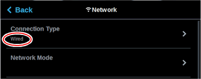
Figure 84: Network Page - Available Networks Row
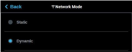
If the Wired connection type is selected, the Network Mode row will be displayed (see Figure 83 (page 60) as a reference). Pressing anywhere within this row will allow you to select between a Static or Dynamic network mode; Dynamic is selected by default. Use the Static and Dynamic radio buttons to select a network mode. After selecting a network mode press the Back button to exit and return to the Network page; the selected network mode will be indicated within the Connection Type row.
Figure 85: Select Wired Network Mode
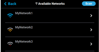
If the Wireless connection type is selected, the Available Networks row will be displayed (see Figure 84 (page 60) as a reference). Pressing anywhere within this row will open a page allowing you to scan for and connect to an available Wi-Fi network. After selecting an available network, entering the password and/or username required to connect to the network (if applicable), and saving the network configuration, press the Back button to exit and return to the Network page; the name of the selected wireless network will be indicated within the Available Networks row.
Figure 86: Select Wireless Network Mode
Dynamic Network Configuration
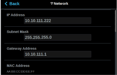
When the Dynamic (DHCP) wired network option is enabled a network server or PC will generate an IP address for the printer. A different IP address may be generated from time to time by the server or PC. The generated IP address will be displayed within the IP Address field, and corresponding Subnet Mask, Gateway Address, and MAC Address information will also be displayed.
When finished, press the Back button to exit and return to the Tools page.
Figure 87: Dynamic Network Configuration
Static Network Configuration
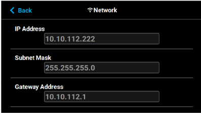
When the Static wired network option is enabled you must manually configure the IP Address, Subnet Mask, and Gateway Address fields for the printer (provided by the system administrator). Use the keypad to configure this information; simply touch a field on the screen to select it and then use the keypad displayed to enter network information. Touch anywhere on the screen outside of the keypad to exit and close the keypad. Press the Apply button to save the network information configured. Once the Apply button has been pressed and network information is saved, network information will not change.
|
|
See your system administrator if you do not know the IP address, Subnet Mask, or Gateway Address. |
When finished, press the Back button to exit and return to the Tools page.
Figure 88: Static Network Configuration
Wi-Fi Network Configuration
When the wireless network option is enabled you can scan for and connect to the printer via your local Wi-Fi network (see Figure 86 (page 61)). Depending on the network’s security requirements you may need to enter a password and/or username in order to connect to the network. Use the keypad to configure this information; simply touch a field on the screen to select it and then use the keypad to enter network security information. Touch anywhere on the screen outside of the keypad to exit and close the keypad. Press the Connect button to save the network information configured. Once the Connect button has been pressed and network information is saved, network information will not change.
Press the Back button to exit the page and return to the Network page; the The name of the selected wireless network will be displayed within the Available Networks row.
Press the Back button to exit the page and return to the Tools page. The Network button will refresh and a blue indicator will be displayed indicating that the printer is configured for a Wi-Fi network.
Figure 90: Enter Network Settings Dialog
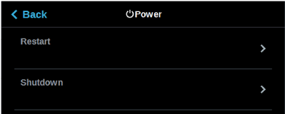
Within the Power page you can restart or shutdown the printer. It is recommended that you use the Shutdown option within this page to power the printer Off, rather than simply pressing the Power ON/OFF button located on the front of the printer.
To access the Power page, press the Power button within the Tools page; a screen similar to the following will be displayed.
Figure 91: Power Page
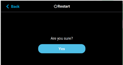
Pressing anywhere within the Restart row will open a dialog allowing you to manually restart the printer.
Figure 92: Restart
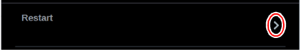
Pressing the Yes button within this dialog will cause the printer to restart automatically. Press the Back button to exit the page and return to the Power page.
Figure 93: Restart Confirmation Dialog
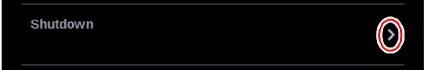
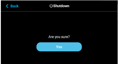
Pressing anywhere within the Shutdown row will open a dialog allowing you to power the printer down.
Figure 94: Shutdown
Pressing the Yes button within this dialog will cause the printer to power down. Press the Back button to exit the page and return to the Power page.
Figure 95: Restart Confirmation Dialog
The Light button is the only option within the Tools page that does not open a new page after being pressed. Instead, the Light button allows you to turn the oven light ON and OFF. An indicator within the upper-left corner of the button displays the current state of the oven light (ON or OFF). The Light button can appear in the following states:
|
Button State |
Description |
|---|---|

|
Oven light is ON. Selecting the Light button in this state will turn the oven light OFF. |

|
Oven light is OFF. Selecting the Light button in this state will turn the oven light ON. |